The Anatomy of a Best-Selling Fiction Book Cover: What Elements You Should Include
- April 2, 2018
- Posted by: admin
- Category: Book Cover Design

Introduction
The cover of a book can be just as important to its success as the story inside. Whether you’re an aspiring fiction author or designer, it’s essential to understand how and why certain elements are used in creating a memorable and eye-catching bestseller. In this guide, we provide tips on how to design effective book covers for your fiction work.
Researching the Genre and Competitors
Before you dive into designing your own fiction book cover, it’s important to understand the genre and the target audience. Researching existing titles in the same genre can provide a useful starting point. Take note of common elements on the covers of your competitors, such as colors, fonts and imagery. These can help guide the design process and determine what works and what doesn’t in creating an effective cover for your title. Always get inspiration from Best Selling Books in intended genres.
Using Images to Communicate Your Book’s Tone and Story
Images play a huge role in how readers perceive your book. They should convey an overall tone to the reader, whether it’s mystery, tension or one of fantasy and escapism. Selecting an image is an art form – you want to be sure that the visuals accurately reflect the story and draw in your target audience. A skilled designer can help you find images that represent the tone and themes of your book, which will boost engagement if chosen correctly.
A perfect example of this is Best Seller Book by Abby Jimenez’s Book Part of Your World. A person looking at the cover can conclude it is a romantic story between persons from different backgrounds.

Choosing Matching Typefaces for Your Title and Author Name
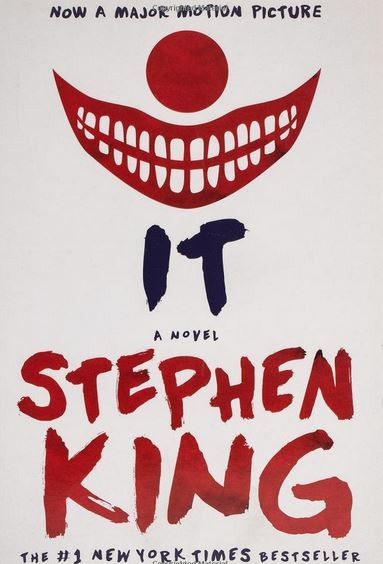
Once you have the perfect image and title established, the last step is to select a typeface that enhances your book cover design. You want your title and author name to stand out, but also be easy to read among other books sold in stores. As a general rule, don’t mix more than two fonts – it can make your book look amateurish. Choose one font for the title and another for the author name. Another important aspect of fonts is that usually well known Author’s name is prominent on cover then anything else like Colleen Hoover’s Books because very prominent name of known author’s gets immediate attention of their fans especially online where attention span is very less (8 Seconds) (also see Dan Brown, Stehphen Kings Books Covers).

Utilizing Color Psychology in Your Design
Exploring color psychology is one of the most effective ways you can use to make your book cover stand out. Colors have a profound effect on human emotions, so pick tones that are associated with evoking an immediate reaction in your readers. For example, green and blue are great choices for drawing in calmness and respect. Alternatively bright colors like yellow or orange may induce feelings of enthusiasm and energy. Once you choose the right colors they will ultimately help set the overall tone of your design.

Connecting Visual Elements to Represent Characters or Symbols From the Book
Once you have the color scheme nailed down, it’s time to move on to creating the visuals for the cover. You can choose visual elements such as typography, patterns, illustrations, and textures that all come together to create an emotional connection with readers. Try selecting symbols, components or characters from your book’s plot and incorporate them into abstract shapes and forms for an engaging design. Negative space can be used to convey mood, hint at mystery and even reinforce the story’s main theme. When combined with appealing colors they become instant eye-catchers!

Conclusion
In times of meager attention span online, it is very important to reach your audience and using perfect cover is of utmost importance. Follow these tips and get better sales and exposure online.
how can we help you?
Contact us at the Consulting WP office nearest to you or submit a business inquiry online.
